How to Choose the Perfect Accent Wall Paint Color
Reading time: 14 minutes
You’ve stared at that blank wall long enough. Maybe you’ve collected a dozen paint swatches, held them up in different lighting, and still felt completely paralyzed by indecision. Sound familiar? Choosing the right accent wall color is one of those design decisions that feels deceptively simple — until you’re standing in the paint aisle at 10 AM on a Saturday, overwhelmed by 3,000 shades of “warm white.”
Here’s the straight talk: a well-chosen accent wall doesn’t just add color — it transforms the emotional atmosphere of an entire room. And in 2026, with interior design trends shifting boldly toward expressive, personality-driven spaces, the stakes feel higher than ever. But getting it right isn’t about luck or having a designer’s eye. It’s about strategic navigation through a series of very answerable questions.
This guide will walk you through exactly how to choose the perfect accent wall paint color — from understanding your room’s existing palette to navigating 2026’s hottest color trends, testing samples properly, and avoiding the most common (and costly) mistakes homeowners make.
Table of Contents
- Why Accent Walls Still Matter in 2026
- Step 1 – Assess Your Room’s Existing Palette
- Step 2 – Understand Color Psychology
- Step 3 – Navigate 2026 Color Trends Strategically
- Step 4 – Choose the Right Wall
- Step 5 – Test Samples Like a Pro
- Common Challenges and How to Overcome Them
- Accent Wall Color Comparison Guide
- Frequently Asked Questions
- Your Accent Wall Action Plan
Why Accent Walls Still Matter in 2026
Every few years, design commentators declare that accent walls are “over.” And every time, homeowners prove them wrong. According to a 2025 survey by the National Association of Interior Designers (NAID), 67% of homeowners who renovated their living spaces included an accent wall element — up from 58% in 2023. The appeal is enduring because the function is real.
Accent walls accomplish several things at once. They create visual anchoring in open-plan spaces, add architectural interest to flat-walled rooms, allow for bold color experimentation without overwhelming commitment, and — perhaps most importantly in 2026 — serve as personal expression in an era where home design has become deeply tied to identity.
The rise of remote and hybrid work has kept people in their homes more than at any point in recent history, and that prolonged exposure to living spaces has made people far more intentional about design. A 2025 Houzz report noted that interior paint projects increased by 34% year-over-year, with accent wall treatments accounting for nearly half of all DIY painting projects.
“The accent wall is no longer just a trend — it’s a permanent fixture in how people personalize their spaces. What changes is the color palette and the intention behind it.” — Maria Chen, Lead Designer at Studio Form, 2025 Architectural Digest interview
Step 1 – Assess Your Room’s Existing Palette
Before you even think about trending colors or personal preferences, you need to do a thorough inventory of what already exists in your room. This is where most homeowners skip ahead too quickly — and end up with a beautiful paint color that clashes with their furniture or looks nothing like it did on the swatch.
Identify Your Fixed Elements First
Fixed elements are the things you’re not going to change: flooring, ceiling, trim, built-in cabinetry, fireplaces, and major furniture pieces. These form the non-negotiable baseline of your color story. List them out — including their undertones, not just their surface colors.
Here’s a practical scenario: Imagine you have medium-toned oak hardwood floors (warm yellow-orange undertones), bright white trim, and a gray linen sectional sofa. Your fixed palette already contains warm, cool, and neutral notes. An accent wall in deep forest green would harmonize beautifully — it’s cool enough to complement the gray sofa, has enough earthiness to echo the warm wood, and pops cleanly against bright white trim. A choice like bright cobalt blue, however, might fight with the warmth in the flooring.
Map Your Light Sources
Lighting is arguably the most underestimated factor in paint color selection. The same paint chip can look drastically different depending on whether your room has north-facing windows (cool, flat light), south-facing windows (warm, abundant light), east-facing (warm morning light), or west-facing (warm afternoon light).
In 2026, smart lighting has added another layer to this calculation. If your home uses tunable LED systems that shift from warm to cool throughout the day, your accent wall will essentially change character twice daily. Colors with strong undertones — like a blue-gray that goes lavender under warm light — need to be tested under multiple lighting conditions before you commit.
Pro Tip: Observe your shortlisted colors at 8 AM, 12 PM, and 8 PM. Take photos. The differences will surprise you and potentially save you from an expensive repainting.
Step 2 – Understand Color Psychology
Color psychology isn’t mysticism — it’s a well-documented field of environmental psychology that can genuinely guide your decision. Choosing a color that feels emotionally right for how you use the space is just as important as whether it looks good.
Matching Color Energy to Room Function
Different rooms call for different emotional tones. A bedroom accent wall should typically evoke calm, safety, and rest. A home office wall should promote focus and mild stimulation. A dining room can handle more social, energizing tones. A living room accent wall is the most flexible — it depends on whether you want the space to feel lively or restorative.
Consider the case of Jamie and Alex Torres, a couple in Austin, Texas who redesigned their home in early 2025. They chose a deep terracotta for their open-plan living-dining area accent wall — a color they loved in a design magazine. Within weeks, they found themselves feeling inexplicably restless in the space, particularly during evening dinners. A consultation with an interior designer revealed the issue: the high-chroma, warm-red terracotta was too stimulating for a space where they also relaxed and unwound. A shift to a more muted, clay-toned version of the same hue solved the problem entirely, preserving the warmth while reducing the visual intensity.
The science is clear here. A 2024 study published in the Journal of Environmental Psychology found that high-saturation warm colors (reds, oranges) measurably increased heart rate and perceived room temperature, while desaturated or cooler tones had the opposite effect. Understanding this before you choose your color is not just useful — it’s transformative.
Quick Color-to-Room Function Reference:
- Navy Blue / Deep Teal: Focus, calm authority — ideal for home offices and libraries
- Sage Green / Olive: Restorative, grounding — perfect for bedrooms and reading nooks
- Warm Terracotta / Clay: Social, inviting warmth — works well in dining rooms and entryways
- Charcoal / Graphite: Sophistication, depth — excellent for living rooms and media walls
- Dusty Rose / Blush: Softness, intimacy — ideal for bedrooms and nurseries
- Mustard / Golden Yellow: Creative energy — great for studios, kitchens, and playrooms
Step 3 – Navigate 2026 Color Trends Strategically
Trends are useful as inspiration — not as mandates. The smartest approach is to identify which 2026 color directions align with your personal taste and existing space, then use that as a starting point rather than a finish line.
In 2026, several clear color directions have emerged from major trend forecasters and paint manufacturers:
Moody Naturals continue to dominate — think deep mossy greens, earthy umbers, and rich mushroom browns. These reflect a broader cultural movement toward biophilic design and a desire for homes that feel anchored and organic. Sherwin-Williams’ 2026 Color of the Year, Quietude Deep, is a perfect example: a smoky sage-green that reads as sophisticated and restorative simultaneously.
Expressive Brights with Restraint — 2026 isn’t about all-over bold color (that was more 2023-2024). Instead, it’s about using one vivid, confident hue on a single wall as a statement. Think rich cobalt, unexpected chartreuse, or a deep saturated plum. The key is pairing that bold choice with restraint everywhere else.
Warm Neutrals with Character — The cold grays of the previous decade have largely given way to warmer, more complex neutrals. Colors like warm linen, aged parchment, and creamy stone dominate as accent walls in minimalist and Japandi-influenced spaces.
“2026 is the year homeowners stopped apologizing for color. We’re seeing bolder commitments to personal expression, but paired with much more sophisticated understanding of tone and undertone.” — Priya Nair, Color Trend Analyst, Benjamin Moore 2026 Forecast Report
Step 4 – Choose the Right Wall
Not every wall in a room is a good candidate for an accent treatment. Choosing the wrong wall can create visual confusion, make a room feel smaller, or simply waste the potential of a great color choice. There are reliable principles here that stand up to scrutiny.
The Focal Point Rule: The best accent wall is typically the one your eye naturally lands on first when you enter the room. In a bedroom, that’s usually the wall behind the headboard. In a living room, it’s often the wall with the fireplace or primary media setup. In a dining room, it’s frequently the wall opposite the entryway.
The Architecture Rule: Choose walls that have architectural interest — chimney breasts, alcoves, built-in shelving, or walls with a window centered on them. These walls already have visual weight; color amplifies rather than creates that weight.
What to avoid: Don’t apply an accent color to a wall that is broken up by multiple doorways, awkward corners, or uneven surfaces. The disrupted plane makes it nearly impossible for the color to read as a cohesive feature.
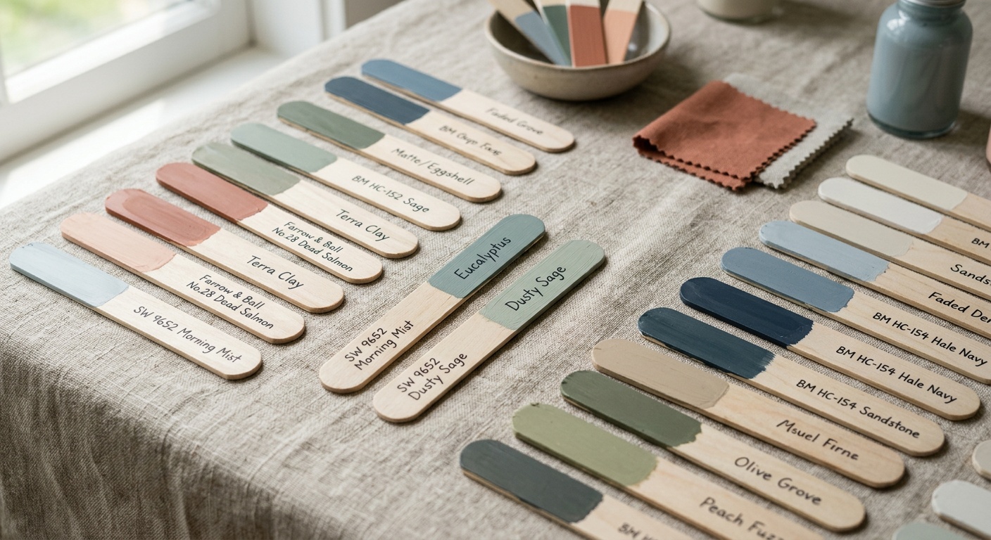
Step 5 – Test Samples Like a Pro
Here’s where most people underinvest their time — and it’s the single step that separates satisfied homeowners from those who end up repainting within six months. Proper sample testing is a process, not an afternoon activity.
The Physical Sample Method
Always buy physical sample pots (most major brands offer 4-8 oz sample sizes). Paint large swatches — at least 12 inches by 12 inches — directly onto your wall in multiple spots: top, middle, and bottom. Different parts of the wall catch light differently, and a color that looks perfect at eye level can read as completely different near the baseboard or ceiling.
In 2026, many paint retailers now offer peel-and-stick sample cards in exact paint formulations, which can be moved around the room and repositioned — a genuinely useful advancement that removes the “we have to reprime this section” problem of traditional sampling.
The Digital Visualization Option
Augmented reality paint apps have improved dramatically. Apps like Sherwin-Williams’ ColorSnap Visualizer and Benjamin Moore’s Color Portfolio now use LiDAR scanning (available on most smartphones from 2023 onward) to create remarkably accurate room renderings. These are excellent for narrowing down your shortlist from eight colors to three — but they should not replace physical sampling for your final decision. Screens simply cannot replicate the way pigment reflects real-world light.
The 48-Hour Rule: Leave your samples on the wall for a minimum of 48 hours before making your decision. Visit them at different times of day. Invite someone else to look — fresh eyes catch things you’ve trained yourself not to see.
Common Challenges and How to Overcome Them
Challenge 1: The Color Looks Nothing Like the Swatch
This is the most common complaint — and it’s almost always caused by one of two things: undertone mismatch or scale effect. Undertone mismatch happens when a color you selected for its surface appearance (a sophisticated gray) reveals its true undertone on a large surface (suddenly it’s undeniably purple). Scale effect occurs because a single 2-inch chip on a white card looks completely different when applied across 80 square feet of wall.
Solution: Always evaluate samples next to the actual fixed elements in your room (hold your swatch against the sofa fabric, the flooring, the trim). And always go larger with your test swatches than feels necessary.
Challenge 2: The Room Feels Too Dark After Painting
This surprises many homeowners who chose their color under showroom lighting or midday sun. Deep, saturated colors absorb light — they’re meant to. In a room with limited natural light, the effect can go from “dramatic and cozy” to “oppressive cave.”
Solution: If you love a deep color but have low natural light, compensate with layered artificial lighting (a combination of ambient, task, and accent lighting). Warm-toned bulbs at 2700K-3000K color temperature are particularly effective at making dark wall colors feel rich rather than heavy. Alternatively, choose a version of your preferred hue that is two to three shades lighter than your original choice — you’ll preserve the character while maintaining livability.
Challenge 3: Disagreement Between Household Members
Accent wall color decisions in shared spaces frequently become household conflicts. One person wants bold; the other wants safe. Both are valid perspectives, and the solution isn’t compromise-by-averaging (which usually results in a color nobody loves).
Solution: Reframe the conversation around function and feeling rather than specific colors. Agree on the emotional outcome you both want for the room (calming? energizing? sophisticated? playful?), then explore colors that deliver that outcome. You may discover that one person’s “bold” and another’s “safe” can meet in a deep, complex neutral that satisfies both needs.
Accent Wall Color Comparison Guide
The table below compares popular 2026 accent wall color families across key decision-making criteria:
| Color Family | Best Room | Light Sensitivity | Trend Longevity | DIY Difficulty |
|---|---|---|---|---|
| Deep Forest Green | Living Room, Library | High | ⭐⭐⭐⭐⭐ Classic | Moderate |
| Warm Terracotta | Dining Room, Entryway | Medium | ⭐⭐⭐⭐ Strong | Easy |
| Navy / Deep Blue | Bedroom, Office | High | ⭐⭐⭐⭐⭐ Timeless | Moderate |
| Warm Greige / Linen | Any Room | Low | ⭐⭐⭐⭐ Versatile | Easy |
| Rich Plum / Berry | Bedroom, Bar Area | Very High | ⭐⭐⭐ Trend-Led | Challenging |
2026 Accent Wall Color Popularity — At a Glance
Based on aggregated data from major paint retailers and design platforms in 2025, here’s how homeowners are currently leaning when choosing accent wall colors:
Source: Aggregated 2025 retail sales and design platform preference data (Houzz, Pinterest Trends, Sherwin-Williams, Benjamin Moore)
Frequently Asked Questions
How do I know if an accent wall color will work with my existing furniture?
The most reliable method is to identify the undertones in both your furniture and your shortlisted paint colors, then assess whether they’re complementary or conflicting. Warm furniture tones (wood, cream, amber) generally work best with warm-toned wall colors or with cool neutrals that have enough depth to contrast without clashing. Cool furniture (gray, charcoal, silver) pairs well with both cool-toned walls and with warm accents that create intentional contrast. Beyond undertones, use the “60-30-10” rule as a gut-check: your dominant room color should account for 60% of the visual space, secondary elements 30%, and your accent wall 10%. If your accent wall feels like it’s competing rather than contributing, the color relationship may need adjustment.
Should I choose a paint finish as carefully as the color itself?
Absolutely — finish has a profound effect on how a color reads and how it functions in a space. For accent walls, eggshell and satin finishes are the most popular choices in 2026 because they offer a slight sheen that makes colors appear richer and more dimensional without being reflective enough to highlight imperfections. Flat/matte finishes are excellent for deep, moody colors where you want the color to absorb light fully and appear velvety — but they show scuffs easily, making them less practical in high-traffic areas. Semi-gloss is rarely used for accent walls except in bathrooms or kitchens where moisture resistance is necessary. As a general rule: the deeper and more saturated the color, the more a matte or eggshell finish complements it. Lighter, brighter colors can often tolerate a satin finish without looking plasticky.
How many paint colors should I test before making a final decision?
Design professionals generally recommend testing no more than three to five colors on your actual wall at one time. Testing more than five simultaneously creates visual noise that makes it genuinely difficult to evaluate any single color objectively. The process should work in stages: use digital visualization tools to narrow a broad shortlist of eight to ten options down to your top four or five, then purchase sample pots for those finalists and apply them directly to your wall. Give each sample a full 48-hour observation period across different lighting conditions before eliminating any. In practice, most confident decisions are made between two final candidates. If you find yourself stuck between two colors that both look good, the rule of thumb from most experienced designers is to go with the bolder one — because the color that felt “almost too much” in sample form almost always settles into feeling perfectly calibrated once it fills the whole wall.
Your Accent Wall Action Plan
You’ve read the theory. Now let’s turn it into forward motion. Here’s your step-by-step action plan — designed to take you from indecision to a finished wall you’ll love for years.
- Audit your room this week. Write down every fixed element — flooring, trim, ceiling, major furniture — and note their undertones. Take photos in morning, afternoon, and evening light. This single step will eliminate at least 40% of color options before you’ve even looked at a swatch.
- Define your emotional goal. Before you look at a single color, answer this question: how do I want to feel in this room? Write it down. Calm. Energized. Sophisticated. Playful. Use that word as your filter for every color decision that follows.
- Create a shortlist of 5-8 colors using a combination of 2026 trend reports, your color psychology knowledge, and your personal taste. Apps like ColorSnap or Color Portfolio can help you preview these digitally in your own space.
- Purchase sample pots and test on your actual wall. Apply samples at least 12″x12″ in multiple spots. Leave them for 48 hours. Observe in all lighting conditions. Narrow to two finalists.
- Make your decision and commit. Order your paint with the right finish for the application, prep your wall properly (repair, sand, prime as needed), and paint with confidence.
As design continues to evolve in 2026 and beyond, one trend is clear: homeowners are moving away from safe, crowd-pleasing choices and toward spaces that genuinely reflect who they are. Your accent wall is one of the highest-impact, lowest-cost ways to participate in that shift. A single gallon of quality paint — typically between $45 and $85 in 2026 — can fundamentally change how a room feels to everyone who enters it.
The real question isn’t which color should I choose — it’s what do I want this room to say about me? When you answer that, the color almost chooses itself.
So tell us: what feeling are you chasing in your next room transformation? Start there, and everything else will follow.