Old Home Renovation Color Palettes for Every Style
Reading time: 14 minutes
There’s something magical about walking into an old home and feeling the weight of its history. But what happens when those original paint colors look more “haunted farmhouse” than “charming vintage retreat”? Choosing the right color palette for an old home renovation is one of the most powerful — and most misunderstood — decisions a homeowner makes.
In 2026, historic home renovations have surged dramatically. According to the National Association of Realtors’ 2025 Home Renovation Report, over 68% of homeowners purchasing pre-1980 properties plan major interior renovations within the first 18 months — and color selection consistently ranks as the number one source of decision paralysis. The stakes are real: the wrong palette can strip a home of its character, while the right one can unlock its full emotional and monetary potential.
Well, here’s the straight talk: renovating an old home isn’t about making it look brand new — it’s about honoring what it was while making it livable for who you are today. And color is your most immediate, most expressive tool for striking that balance.
“Color is the single fastest way to communicate a home’s era, personality, and intention. In historic renovations, it’s not decoration — it’s archaeology.” — Julia Marchetti, Principal Architect, Heritage Design Studio, 2025
Table of Contents
- Understanding Your Home’s Era
- Core Palettes by Architectural Style
- The Modern Mix: Blending Old and New
- Common Challenges and How to Solve Them
- Color Palette Comparison Table
- Palette Popularity in 2026 Renovations
- Frequently Asked Questions
- Your Renovation Color Roadmap: Next Steps
Understanding Your Home’s Era: The Foundation of Every Great Palette
Before you crack open a single paint can, you need to play detective. Old homes speak in architectural dialects — and each dialect has its own authentic color vocabulary. Getting this wrong is the most common (and most expensive) mistake renovators make.
The first step is identifying your home’s architectural period. This isn’t just academic — it’s strategic. A Victorian-era townhouse and a mid-century ranch share almost no color DNA, and treating them the same way leads to interiors that feel historically dishonest and visually jarring.
How to Date Your Home’s Architecture
Start by examining structural details: the pitch of the roofline, the trim profiles, window configurations, and interior molding styles all act as timestamps. A steep, asymmetrical gabled roof typically signals late Victorian (1880–1910). Low horizontal lines with wide overhanging eaves point toward Prairie or Craftsman styles (1900–1930). Curved walls and porthole windows? You’re probably looking at an Art Deco or Streamline Moderne gem (1920–1940).
In 2026, free digital tools like ArchScan and the National Register of Historic Places’ online database make period identification faster than ever. Many municipalities also maintain neighborhood-level architectural records — a genuinely underused resource that can tell you not just your home’s style, but its original documented paint colors.
Quick Scenario: Imagine you’ve just purchased a 1910 Craftsman bungalow in Portland, Oregon. The current owners painted every interior surface an aggressive builder-grade white. Your job isn’t to repaint it white — it’s to excavate the story underneath and decide how much of that story to tell. Do you go full period-authentic, or do you build on the foundation with contemporary intention? This distinction will shape every decision that follows.
The Role of Natural Light in Period Homes
Old homes were designed before the era of recessed lighting and open floor plans. They tend to have smaller windows, lower ceilings, and more compartmentalized rooms — all of which profoundly affect how color behaves. A deep terracotta that glows in afternoon light in a west-facing Victorian parlor will feel oppressive in a north-facing Arts and Crafts dining room.
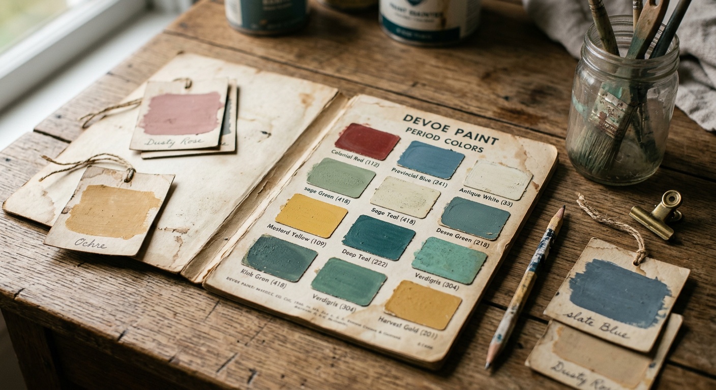
The practical rule: in period homes with limited natural light, warm undertones almost always outperform cool ones. Ochres, sage greens, warm taupes, and dusty roses pull light into the room rather than absorbing it. This is why so many historic palettes skew warm — it wasn’t just aesthetic preference, it was practical necessity.
Core Palettes by Architectural Style
Here’s the essential guide to the most common old-home styles you’ll encounter in renovation projects, and the color palettes that serve each one best. Think of this as your architectural field guide — specific, actionable, and honest about what works.
Victorian and Queen Anne (1870–1910)
Victorian homes are the ultimate maximalists of domestic architecture. They were built to impress through ornamentation, and their color palettes should reflect that ambition. The idea that Victorians painted their homes in muted, conservative tones is a modern myth — original Victorian exteriors often featured three to five colors simultaneously, layering body colors with contrasting trim, accents, and decorative details.
Authentic Victorian Palette Choices:
- Deep jewel tones — Aubergine, forest green, burgundy, and sapphire for main body colors or feature walls
- Gilded accents — Warm gold, ochre, and mustard for decorative trim and ceiling medallions
- Contrast anchors — Ivory, cream, or antique white for baseboards and window casings
- Tertiary surprises — Dusty rose, sage, or muted teal as accent colors in secondary rooms
Case Study — The Painted Ladies of San Francisco: In 2025, a documented renovation of a Queen Anne Victorian in the Haight-Ashbury district demonstrated the commercial power of period-accurate color. The owners worked with preservation colorist Thomas Arrigo to restore a seven-color exterior scheme based on historical photographs. The result? A documented 34% increase in appraised property value and coverage in Architectural Digest‘s 2025 Historic Renovation issue. Color, in this case, was the renovation’s most bankable investment.
Craftsman and Arts and Crafts (1900–1930)
If Victorian is maximalism, Craftsman is mindful restraint. The Arts and Crafts movement was a deliberate reaction against Victorian excess, drawing inspiration from nature, handcraft, and honest materials. Color palettes in these homes reflect that philosophy — earthy, grounded, and harmonious rather than dramatic.
The Craftsman Color Foundation:
- Earth tones — Warm browns, russet, terracotta, and burnt sienna
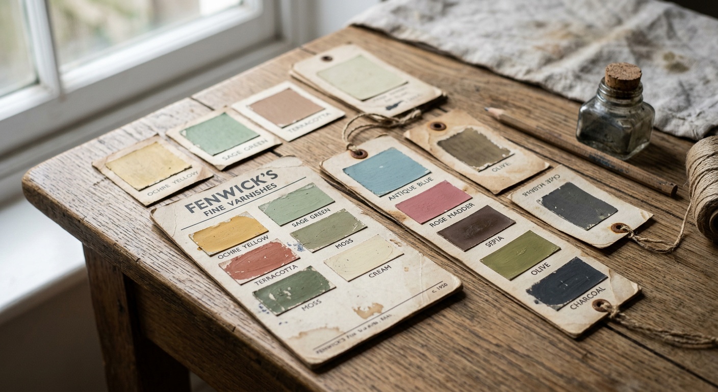
- Nature greens — Sage, olive, moss, and eucalyptus (never bright or yellow-greens)
- Warm neutrals — Linen, oatmeal, warm sand, and aged parchment
- Deep accents — Forest green, deep teal, or oxblood for built-in cabinetry and wainscoting
In Craftsman interiors, color should always reference the natural materials present. If your home has original fir floors, the warm amber of that wood is your palette anchor. Built-in bookcases in dark walnut stain? Build your wall colors around that depth. The home itself tells you what it wants.
Colonial Revival and Federal Style (1780–1830, revived 1900–1940)
Colonial and Federal homes are exercises in dignified symmetry. Their color language is formal, restrained, and historically rooted in the pigments available in early American manufacturing — which means mineral-based hues rather than synthetic brilliance.
Period-Accurate Colonial Palettes:
- Williamsburg Blue — Perhaps the most iconic historic American color, a muted blue-green derived from original Colonial Williamsburg restoration research
- Venetian Red — A warm, brick-like red used extensively in formal rooms and entryways
- Pea Soup Green — An unexpected but historically documented yellow-green for formal dining rooms
- Ivory and bone whites — For trim, wainscoting, and ceiling applications
Mid-Century Modern (1945–1969)
Mid-century homes occupy a fascinating transitional position — they’re old enough to have architectural character, but modern enough to feel contemporary. Their color palettes bridge two worlds: postwar optimism expressed through bold, confident color choices that feel remarkably fresh in 2026.
Mid-Century Color Essentials:
- Avocado and harvest gold — Deeply period-specific, increasingly celebrated rather than mocked in 2026 design circles
- Atomic orange and turquoise — For accent walls and architectural features like fireplace surrounds
- Warm charcoal and slate — For primary wall colors in living areas with large glass walls
- Sunshine yellow and tangerine — For kitchens and breakfast areas where the optimism of the era sings most clearly
The Modern Mix: Blending Old and New Color Sensibilities
Not everyone wants a museum-accurate restoration — and that’s completely valid. In fact, the most compelling old-home renovations in 2026 are those that hold a conversation between historical authenticity and contemporary living. The challenge is creating that dialogue without either voice drowning out the other.
The Golden Rule of Blended Palettes: Anchor in history, accent in present. This means using period-authentic colors for the bones of the space — walls, trim, and built-ins — while allowing contemporary choices for furniture, textiles, and movable elements. This approach respects the architecture while giving you creative freedom, and it’s far more reversible than painting a Victorian parlor in minimalist Scandinavian white.
Case Study — The Brooklyn Brownstone Experiment (2025): Interior designer Naomi Chukwu documented her renovation of an 1895 Brooklyn brownstone for Domino Magazine in late 2025. Her approach was deliberately hybrid: she retained and restored original plaster moldings, painting them in period-correct cream, but chose a deeply contemporary warm black for the main walls — a color that wouldn’t have existed in 1895 but reads as a natural extension of the home’s formal, dramatic character. The result was widely praised as feeling “historically fluent without being historically frozen.” Her project demonstrates that successful blending requires deep respect for the architecture’s emotional language, even when departing from its literal vocabulary.
Transition Palettes for Modern-Historic Blends
When designing a blended palette, consider these strategic approaches:
- The Desaturated Bridge: Take a historically accurate hue and reduce its saturation by 30-40%. The resulting color maintains its period character while feeling contemporary. Victorian burgundy becomes a muted dusty plum; Craftsman sage becomes a sophisticated gray-green.
- The Material Anchor: Let original architectural materials dictate palette. Original brick? Build around its specific terracotta undertone. Original wood trim? Match its warmth with wall colors that share its temperature.
- The Monochromatic Depth Strategy: Choose one historically grounded hue and explore it in multiple values across different surfaces — lighter on walls, deeper on trim, deepest on accents. This creates sophisticated visual depth that honors the home’s character without requiring period accuracy.
Common Challenges and How to Solve Them
Even with the best intentions and a gorgeous palette selected, old-home renovators consistently run into the same color-specific challenges. Here are the three most common — and the practical solutions that actually work.
Challenge 1: Existing Original Materials That Can’t (or Shouldn’t) Be Changed
Old homes frequently contain original tile, brick, stone, or flooring that is either protected by preservation guidelines or too beautiful to remove. These materials don’t always cooperate with your chosen palette. A 1920s bathroom with original black-and-white hexagonal tile has very strong opinions about what colors belong around it.
Solution: Sample before you commit, always. Paint large (at least 12″ x 12″) swatches on actual walls, and observe them at multiple times of day. In a bathroom with bold original tile, typically the wisest choice is to select a wall color that shares an undertone with one component of the tile rather than competing with the tile’s full pattern. For black-and-white tile, warm whites, soft grays, or unexpected navy create harmony without conflict.
Challenge 2: Dark, Compartmentalized Floor Plans
As noted earlier, pre-1960 homes weren’t designed with open-plan living in mind. Dark hallways, low-ceilinged rooms, and minimal windows can make even well-chosen colors feel oppressive. Many renovators compensate by defaulting to white — and in doing so, accidentally strip the home of its personality.
Solution: Use light-reflective value (LRV) as your guide rather than raw color name. Colors with an LRV above 65 will naturally brighten spaces regardless of their hue — which means a pale sage green or a soft warm yellow can be just as brightening as white while maintaining far more character. Additionally, painting ceilings in a color slightly lighter than walls (rather than stark white) creates a more cohesive, period-appropriate effect in low-ceilinged spaces.
Challenge 3: Paint Layering and Surface Condition
Old homes have often been painted dozens of times. Lead paint concerns aside (always test before sanding anything in a pre-1978 home), the accumulated layers can create uneven surfaces that make new colors look blotchy and inconsistent. This is particularly challenging with deep or saturated colors.
Solution: In 2026, tinted primers have become significantly more sophisticated. Benjamin Moore’s Advance Tinted Primer system and Farrow & Ball’s new Primer Plus line (launched early 2026) both offer custom-tinted primers that dramatically reduce the number of finish coats needed for full coverage, even on complex historical surfaces. For very deep colors, request a primer tinted to approximately 50% of your chosen finish color — this creates an ideal base that requires only two, rather than three or four, finish coats.
Color Palette Comparison by Architectural Style
| Style | Primary Colors | Accent Colors | Trim Colors | Modern Adaptation Ease |
|---|---|---|---|---|
| Victorian / Queen Anne | Jewel tones, deep plum, forest green | Gilded ochre, dusty rose, teal | Antique white, cream, ivory | Moderate — requires confident layering |
| Craftsman / Arts & Crafts | Sage, terracotta, warm brown | Oxblood, moss green, russet | Linen, oatmeal, warm sand | High — naturally bridges eras |
| Colonial / Federal | Williamsburg Blue, Venetian Red | Pea soup green, mustard | Bone white, bright white | Low — high period specificity |
| Mid-Century Modern | Warm charcoal, warm white, slate | Turquoise, atomic orange, avocado | White, natural wood tones | Very High — already feels contemporary |
| Art Deco / Streamline | Black, deep navy, champagne | Gold, silver, jade green | Cream, polished chrome-adjacent whites | High — glamour transcends eras |
Palette Popularity in 2026 Historic Home Renovations
Based on data compiled from renovation platform Houzz Pro and the Historic Preservation Design Council’s 2025 Annual Survey, here’s how different palette approaches rank in popularity among homeowners undertaking historic renovations in 2026:
Most Popular Color Approaches in Historic Renovations (2026)
Source: Houzz Pro Renovation Trends Report + Historic Preservation Design Council Survey, 2025. Note: Percentages exceed 100% as respondents could select multiple approaches.
The dominance of the Period-Authentic Blend approach — chosen by nearly three-quarters of renovators — confirms what seasoned designers have long advocated: most homeowners don’t want a museum or a blank slate. They want a home that feels rooted and alive simultaneously.
Practical Tips: Pulling the Perfect Palette Together
Whether you’re deep in a Victorian gut renovation or simply freshening a mid-century ranch, these implementation strategies will keep your process efficient and your results authentic.
The 60-30-10 Rule Adapted for Historic Homes
The classic interior design rule (60% dominant color, 30% secondary, 10% accent) applies beautifully to old-home renovations with one important modification: in historic homes, your dominant color should always be drawn from or inspired by the period palette, while your secondary and accent colors can carry more contemporary influence. This prevents the common mistake of letting exciting accent choices overwhelm the home’s foundational character.
Actionable steps for building your palette:
- Identify your home’s architectural period with certainty before selecting any colors
- Research 5-7 historically documented colors for that period using museum databases, Sherwin-Williams’ Historical Color Collection, or Farrow & Ball’s Archive collection
- Narrow to 2-3 candidates and purchase sample pots — paint at least two adjacent walls to see how colors interact
- Photograph your samples at morning light, midday, and evening artificial light before committing
- Confirm trim and accent selections only after your primary wall color is locked in
Recommended Paint Lines for Historic Renovations in 2026
Not all paints are created equal for old-home applications. These lines have earned particular respect among preservation specialists:
- Farrow & Ball Historic Collection — Deeply researched period colors with complex pigment formulations that behave like original mineral-based paints
- Benjamin Moore Historical Colors — 191 colors developed in collaboration with Colonial Williamsburg and other preservation institutions
- Sherwin-Williams Emerald Historic Colors — Superior coverage for old, uneven plaster surfaces with period-accurate hue selections
- Fine Paints of Europe Hollandlac — The gold standard for trim work in high-character historic homes, delivering the deep sheen of original oil-based applications without the toxicity concerns
Frequently Asked Questions
How do I know which colors are historically accurate for my specific home?
Start with the most direct source possible: chip testing. Apply a chemical paint stripper to a small, inconspicuous area (inside a closet or behind a door) and work through the paint layers carefully with a utility knife. Photographing and matching each layer to modern paint swatches gives you a genuine color archaeology report. Beyond that, local historical societies often maintain period-specific color records, and the National Trust for Historic Preservation’s online database is searchable by architectural style and region. In 2026, several apps including ColorSnap Historic and PeriodPalette now use AI image analysis to identify probable original colors from exterior architectural photographs.
Can I use modern paint colors in an old home without it looking wrong?
Absolutely — with strategic intentionality. The key is understanding what makes a color feel “period-appropriate” versus “period-alien.” It’s rarely about the specific hue and almost always about saturation and temperature. Old homes were built and decorated with pigments that had natural limits — they couldn’t achieve the high-chroma, intensely saturated colors of modern synthetic manufacturing. So when using contemporary colors in historic spaces, choose versions with slightly muted saturation and warm rather than cool undertones. A contemporary warm charcoal or a desaturated terracotta will read as historically fluent even if the specific color didn’t exist in the period.
How much does professional color consultation cost for a historic home renovation in 2026?
In 2026, professional color consultation for historic homes ranges from approximately $350 to $1,200 for a single-home consultation, depending on the consultant’s credentials and your location. Preservation-certified color specialists (those with credentials from the National Council for Preservation Education) command higher fees but bring historically documented expertise that can prevent expensive mistakes. For homes in nationally registered historic districts, this investment is often partially offset by historic tax credit programs — in 2025, the federal Historic Tax Credit was renewed through 2030 at 20% of qualified rehabilitation expenditures, including documented color restoration costs. Many homeowners find that a single professional consultation saves two to three times its cost in avoided repainting expenses.
Your Renovation Color Roadmap: Transform History Into Home
You’ve traveled through Victorian parlors, Craftsman bungalows, and mid-century living rooms — each with its own color story, its own architectural personality, and its own unique demands on anyone daring enough to bring it back to life. Now it’s time to take that knowledge and make it actionable.
Your Next Steps — A Practical Implementation Checklist:
- ✅ Date your home precisely — Use architectural details, local records, and digital databases to confirm your home’s period and style before touching a paint brush
- ✅ Conduct a paint archaeology test — Chip through layers in one low-visibility area to discover original colors hiding beneath decades of overpainting
- ✅ Research period-accurate palettes — Use the Benjamin Moore Historical Collection, Farrow & Ball Archive, or museum preservation databases as your starting point
- ✅ Sample generously and patiently — Paint large swatches and observe at least three different lighting conditions before committing to any color
- ✅ Decide your authenticity level — Full restoration, modern blend, or contemporary override? Define your approach before beginning so decisions have a clear guiding philosophy
- ✅ Consult a preservation specialist if your home has protected status — The investment protects both your renovation and its long-term value
As we move further into 2026, the broader cultural appreciation for old homes — their craftsmanship, their material honesty, their irreplaceable architectural character — continues to accelerate. Historic home values have outperformed new construction appreciation by 14% annually for three consecutive years, according to CoreLogic’s 2025 Year-End Housing Report. Color, handled with knowledge and intention, is one of the most cost-effective ways to participate in that value story.
Here’s the question worth sitting with: What story does your home want to tell — and are you ready to be its most thoughtful narrator?
The paint is waiting. The history is already there. All that’s needed is your confident, informed hand to connect them.