Cape Cod Home Renovation: Exterior Paint Colors That Impress
Reading time: 14 minutes
Picture this: You’re standing at the curb, coffee in hand, staring at your Cape Cod home. The bones are beautiful — that classic steep roofline, the symmetrical facade, the cozy dormer windows peeking out from the second floor. But the paint? It’s telling a story from a decade ago, and not a particularly flattering one. If this sounds familiar, you’re in good company. In 2026, Cape Cod homeowners across New England — and in Cape Cod-style neighborhoods nationwide — are investing more than ever in exterior renovations, with paint color selection sitting at the very top of the priority list.
Choosing the right exterior paint color for a Cape Cod home isn’t just about aesthetics. It’s about preserving architectural integrity, boosting curb appeal, increasing resale value, and making a statement that’s both timeless and current. Done right, the perfect palette can transform a dated cottage into a showstopping neighborhood anchor. Done wrong, and you’ll be repainting sooner than you’d like.
This guide cuts through the overwhelm and delivers a strategic, practical roadmap for selecting, pairing, and applying exterior paint colors that genuinely impress — backed by 2026 market data, real homeowner examples, and expert insights from color consultants and renovation specialists.
Table of Contents
- Why Color Choice Matters More Than Ever in 2026
- Understanding Cape Cod Architecture First
- 2026’s Most Impressive Color Palettes
- Breaking Down the Three Color Components
- Real Homeowner Case Studies
- Common Mistakes and How to Avoid Them
- Color Popularity & ROI Visualization
- Palette Comparison: Side-by-Side Analysis
- Frequently Asked Questions
- Your Cape Cod Color Roadmap: Next Steps
Why Color Choice Matters More Than Ever in 2026
The exterior paint market has evolved dramatically. According to the 2025 Remodeling Impact Report by the National Association of Realtors, exterior painting consistently ranks among the top five renovation projects that yield the highest return on investment — with an average ROI of 51% to 153% depending on region and color selection. In competitive housing markets across Massachusetts, Connecticut, and the Carolinas — where Cape Cod architecture remains deeply embedded in neighborhood fabric — a well-executed paint job can add between $15,000 and $45,000 to a home’s perceived market value.
In 2026, buyers are more visually sophisticated than ever. Social media platforms have trained eyes to recognize and desire curb appeal on a near-subconscious level. Homes photographed well for real estate listings — with cohesive, intentional color schemes — receive 32% more online engagement than those with neutral or outdated exteriors, according to Zillow’s 2025 Consumer Housing Trends Report.
But here’s the straight talk: impressive exterior color for a Cape Cod isn’t about following every trend — it’s about honoring the architecture while making deliberate, confident choices. The homeowners who get this right see the difference in every compliment from neighbors, every potential buyer’s lingering glance, and every appraisal number.
The Emotional Psychology of Exterior Color
Color isn’t just visual — it’s emotional. Research from the American Institute of Architects (2024) found that exterior paint color is the single most commented-upon feature when survey participants described their emotional reaction to a home. Soft blues evoke calm and trust. Deep greens signal connection to nature and stability. Warm whites communicate cleanliness and approachability. Slate grays project sophistication and modernity.
For Cape Cod homes specifically, the architectural style already carries nostalgic, coastal, and traditional associations. Your color choices either amplify those associations positively — or create cognitive dissonance that subtle viewers can’t quite name but definitely feel.
Understanding Cape Cod Architecture First
Before you open a single paint chip, you need to understand what you’re working with. Cape Cod homes have specific architectural features that directly influence color decisions. Getting this foundation right is non-negotiable.
Defining Architectural Features That Drive Color Decisions
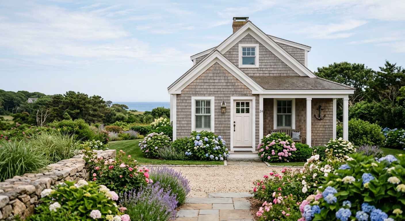
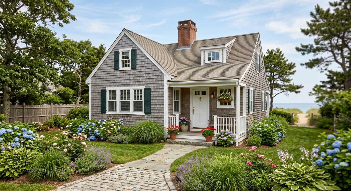
The classic Cape Cod, originating from 17th-century New England and popularized in post-WWII suburban developments, typically features:
- Steep, symmetrical gabled roof: Often 8:12 to 12:12 pitch — this dominant feature means your roof color (or shingle material) is essentially a “fourth color” in your palette
- Dormer windows: These charming protrusions need careful attention — they’re often picked out in trim color or given a subtle contrast treatment
- Cedar shingle or clapboard siding: Both have distinct textures that interact differently with paint — clapboard takes color more uniformly, while shingles create shadow play
- Central chimney or side chimney: Usually brick, which introduces warm red-orange undertones you must account for in your palette
- Symmetrical front facade with centered door: This makes the front door color selection extraordinarily high-impact
- Low profile, close to the ground: Colors that “lift” the home visually — lighter body tones, crisp white trim — tend to work beautifully
Pro Tip: Walk around your home at different times of day — 8 AM, noon, and 5 PM — and photograph it. Light dramatically changes how colors read on exterior surfaces. A warm greige that looks perfect at noon may shift orange in late afternoon light. This simple exercise can save you from a very expensive mistake.
New England vs. National Cape Cod Contexts
If your Cape Cod sits on the actual Cape in Massachusetts, you’re working within a specific environmental palette — salt air, grey-blue skies, weathered wood, coastal flora. Colors that feel “right” in this context tend toward seafoam greens, dusty blues, warm whites, and rich navys.
If your Cape Cod-style home sits in a suburban development in Ohio or the Carolinas, you have more creative latitude. The surrounding landscape, neighborhood palette, and regional light quality (warmer and more golden in the South, cooler and more diffused in the Midwest) should all inform your choices.
2026’s Most Impressive Color Palettes for Cape Cod Homes
The 2026 exterior color landscape is defined by a push toward intentionality. Gone are the days of playing it safe with builder-grade beige. Today’s standout Cape Cods embrace bold simplicity — a strong, character-rich body color anchored by clean whites or contrasting dark trims.
The Top Five Palette Directions in 2026
1. Coastal Modern: Deep Navy + Crisp White + Black Hardware
This palette has dominated Cape Cod renovations in 2025 and shows no sign of slowing. Benjamin Moore’s Hale Navy (HC-154) or Sherwin-Williams’ Naval (SW 6244) as the body color, paired with Chantilly Lace or Extra White trim, and matte black door hardware and shutters creates a strikingly contemporary take on the classic cottage. This combination photographs extraordinarily well and reads as both timeless and current.
2. Sage & Stone: Muted Green + Warm Cream + Weathered Wood Accents
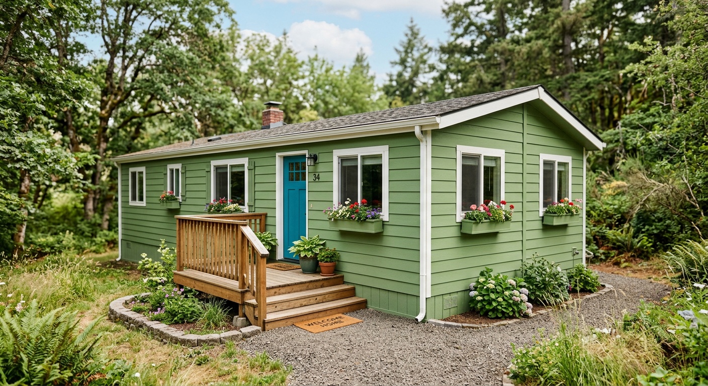
Perhaps the single fastest-growing palette for Cape Cod homes in 2026, this approach uses earthy, desaturated greens — think Benjamin Moore’s Saybrook Sage (HC-114) or Farrow & Ball’s Mizzle (233) — against creamy off-whites and natural wood elements. It connects the home to its landscape and feels deeply rooted. Particularly effective in wooded or rural settings.
3. Classic Revival: Benjamin Moore White Dove + Charcoal Shutters
Never goes out of style, never feels boring when executed with precision. White Dove (OC-17) is consistently one of Benjamin Moore’s top-selling exterior whites because it reads as warm without veering yellow. Pair with Kendall Charcoal shutters and a deep red or hunter green front door — and you have a Cape Cod that looks like it belongs on a magazine cover.
4. Warm Greige + Chocolate Brown Trim
A more unexpected choice that’s gaining traction in 2026. Warm, complex greiges — beige-greys with distinct warmth — like Sherwin-Williams Accessible Beige (SW 7036) or Benjamin Moore’s Revere Pewter (HC-172) grounded by deep chocolate or espresso trim create a sophisticated, cozy aesthetic. Particularly well-suited to older Cape Cods with mature trees and established landscaping.
5. Bold Moody Darks: Black, Charcoal, or Deep Forest
The most daring option — and increasingly the most admired. Dark-body Cape Cods painted in near-blacks like Iron Ore (SW 7069) or forest darks like Black Forest Green create a dramatic silhouette that makes the architecture pop against any backdrop. This approach requires excellent condition of exterior surfaces and confident execution, but the results are genuinely showstopping.
Breaking Down the Three Color Components
Every impressive exterior paint scheme has three distinct layers working in harmony. Miss any one of them and the whole palette falls flat.
Body Color: Your Dominant Statement
The body color covers the largest surface area — typically 60-70% of what viewers see. This is your primary investment and your biggest decision. For Cape Cod homes, body colors that work best share certain characteristics: they have depth without being muddy, they have enough saturation to stand up to natural light, and they complement rather than fight the roof color.
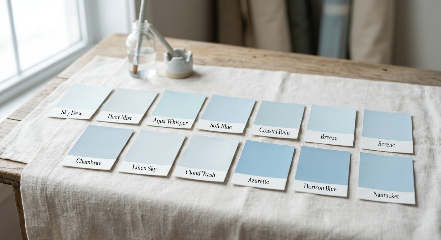
When selecting your body color, hold large sample swatches (at least 12″x12″) against the actual wall in both full sun and shade before committing. Small chip samples lie — colors almost always appear more saturated and different when applied to large surfaces.
Trim Color: The Defining Edge
Trim color defines and articulates the architectural details — fascia boards, corner boards, window casings, door surrounds. In Cape Cod architecture, trim is particularly impactful because the style relies on clean lines and geometric precision. The most reliable approaches:
- High contrast trim (white or near-white against dark body): Crisp, graphic, modern
- Tone-on-tone trim (slightly lighter or darker than body): Sophisticated, subtle, elegant
- Accent trim (a third color that introduces a pop): Playful but requires expert execution
Accent Color: The Exclamation Point
Front door, shutters, and potentially dormers represent your accent opportunities. This is where personality enters the equation — where you signal to visitors (and buyers) that this is a home with intention. In 2026, the front door colors generating the most positive response on Cape Cods include:
- Classic Deep Red (Benjamin Moore Caliente AF-290)
- Heritage Navy (a shade slightly different from the body if using a navy palette)
- Sage Green (as an accent against white or cream bodies)
- Matte Black (contemporary, versatile, universally effective)
- Cheerful Yellow (specifically Hawthorne Yellow HC-4 — traditional and joyful)
Real Homeowner Case Studies
Case Study 1: The Wellfleet, MA Transformation
In the summer of 2025, homeowners Mark and Diane Kelleher tackled their 1952 Cape Cod in Wellfleet, Massachusetts — a home with original cedar shingles, a red brick chimney, and decades of accumulated paint layers. Working with color consultant Sarah Hennessey of Cape Cod Color Studio, they chose a palette that honored the home’s coastal heritage while bringing it firmly into 2026.
The decision: Sherwin-Williams Privilege Green (SW 6193) as the shingle stain body color, paired with Alabaster (SW 7008) trim and a deep navy blue door in Benjamin Moore’s Hale Navy. The result was immediate and dramatic — neighbors stopped to compliment the transformation within days of completion. When the Kellehers listed the home in early 2026, it sold in four days at 8.3% above asking price, a result their agent directly attributed to the curb appeal transformation.
Key lesson: Working with the existing brick chimney’s warm undertones — rather than fighting them with cool grays — was critical to the palette’s success. Hennessey specifically chose Privilege Green because its warm yellow undertones harmonize with red brick rather than clashing.
Case Study 2: The Suburban Cape Cod Makeover in Naperville, IL
Not all Cape Cods sit on the actual Cape. The Chen family’s 1968 Cape Cod in Naperville, Illinois presented different challenges: a beige-dominated neighborhood, a west-facing front facade (challenging warm afternoon light), and a homeowners association with specific palette restrictions.
Working within HOA guidelines that required “historically appropriate colors,” the Chens selected Benjamin Moore White Dove OC-17 as the body, Kendall Charcoal HC-166 for shutters and trim accents, and a classic red door in Caliente AF-290. On a block of beige and tan homes, the White Dove/Charcoal combination made their home stand out with elegance rather than eccentricity. A 2026 appraisal confirmed a $23,000 value increase attributed partly to the exterior renovation and landscaping refresh completed alongside it.
Common Mistakes and How to Avoid Them
Even well-intentioned Cape Cod paint projects can go sideways. Here are the three most common mistakes renovation specialists see in 2026 — and precise strategies to avoid each.
Mistake 1: Ignoring the Roof Color
Your roof is always in the picture. Dark charcoal shingles (the current standard) pair beautifully with almost any palette. But if you have aging brown, green-toned, or mixed-color shingles, they’ll undermine even the most carefully selected paint palette. Before investing in paint, assess your roof. If you’re within five years of replacement, consider timing both projects together and selecting complementary materials intentionally.
Solution: Hold a large paint swatch against your actual roof (or use a digital rendering tool like Sherwin-Williams’ ColorSnap Visualizer) to test compatibility before purchasing any paint.
Mistake 2: Using Too Many Colors
The classic amateur mistake is applying four or five distinct colors across body, trim, shutters, door, dormers, and gutters. The result is visual chaos that reads as confusion rather than personality. Cape Cod architecture is fundamentally defined by restraint and proportion — honor this with your palette.
Solution: Stick to the three-component system. Body, trim, accent. Three colors. Maximum four if the chimney truly demands a separate treatment. Every additional color requires expert justification.
Mistake 3: Skipping Proper Surface Preparation
In 2026, premium paints — Benjamin Moore Aura Exterior, Sherwin-Williams Emerald Exterior, Farrow & Ball Exterior Eggshell — deliver extraordinary results when applied to properly prepared surfaces. Applied over peeling, chalky, or poorly primed surfaces, even the most expensive paint fails within two to three years. Many homeowners invest $800 in paint and $200 in prep when the ratio should be reversed.
Solution: Budget at minimum 30-40% of your total paint project cost for preparation — power washing, scraping, sanding, priming, and caulking. This is where longevity and quality are built.
Color Palette Popularity & Curb Appeal ROI in 2026
Based on data aggregated from renovation platforms, real estate appraisers, and color consultants surveyed in 2025-2026, here’s how the top Cape Cod exterior color approaches compare in popularity and average curb appeal ROI:
2026 Cape Cod Exterior Palette: Popularity & Avg. Curb Appeal ROI
Sources: 2025-2026 NAR Remodeling Impact Report, Zillow Housing Trends, Regional Appraiser Survey Data
Palette Comparison: Side-by-Side Analysis
| Palette | Best For | Difficulty Level | Avg. Repaint Cycle | Resale Impact |
|---|---|---|---|---|
| Navy + White | Coastal, traditional neighborhoods | Moderate | 7–10 years | Very High ⭐⭐⭐⭐⭐ |
| Sage Green + Cream | Wooded, rural, nature-adjacent | Moderate–High | 7–10 years | High ⭐⭐⭐⭐ |
| White Dove + Charcoal | Universal; any neighborhood type | Low–Moderate | 8–12 years | Very High ⭐⭐⭐⭐⭐ |
| Warm Greige + Dark Trim | Mature landscaping, established suburbs | Low | 8–12 years | Moderate ⭐⭐⭐ |
| Moody Dark / Black | Contemporary buyers, upscale markets | High | 5–8 years | Very High ⭐⭐⭐⭐⭐ |
Frequently Asked Questions
How do I choose between a warm white and a cool white for Cape Cod trim?
The distinction is subtle but critically important. Warm whites — like Benjamin Moore White Dove (OC-17) or Sherwin-Williams Alabaster (SW 7008) — contain slight yellow or pink undertones that read as soft and approachable, especially in afternoon sunlight. Cool whites — like Chantilly Lace (OC-65) or Extra White (SW 7006) — are crisper and more graphic, working especially well against darker body colors like navy or forest green. As a practical rule: if your body color has warm undertones (greens, yellows, reds), use a warm white trim. If your body is cool (navy, blue-grey, charcoal), a cool crisp white creates the most satisfying contrast.
Can I use a dark exterior paint on a Cape Cod without it looking oppressive or small?
Absolutely — and in 2026, done right, it’s one of the most impressive choices you can make. The key is contrast management. Dark body colors like Iron Ore or Tricorn Black work on Cape Cods when paired with bright white trim that clearly defines architectural edges, when the surrounding landscaping includes light-colored plants or hardscaping that create visual breathing room, and when window trim is carefully picked out. Homes with good natural light exposure — particularly south or east-facing facades — absorb dark colors confidently. North-facing dark homes can feel heavier, so compensate with brighter trim and door accent colors.
How much should I budget for a complete exterior paint job on a Cape Cod home in 2026?
For a standard 1,500–2,000 square foot Cape Cod, expect to budget between $4,500 and $12,000 for professional exterior painting in 2026, depending on your region, the condition of existing surfaces, paint brand quality, and labor costs. In high-cost markets like coastal Massachusetts or Connecticut, $8,000–$14,000 is increasingly standard. Material costs for premium paints like Benjamin Moore Aura Exterior or Sherwin-Williams Emerald run approximately $70–$90 per gallon, and a full exterior typically requires 15–25 gallons depending on the number of coats and surface porosity. The single most important budget principle: never cut corners on surface prep. A professional prep job protects your investment for 8–12 years; skipped prep means repainting in 3–5.
Paint Your Future: Your Cape Cod Color Roadmap
You now have everything you need to approach your Cape Cod exterior renovation with genuine strategic clarity. Let’s distill it into a concrete action sequence you can begin this week:
- Assess your architecture and context — Document your roof color, chimney material, siding condition, and neighborhood palette. Take photos at three different times of day. Identify your architectural style’s sub-type (full Cape, half Cape, expanded Cape) as this affects proportion decisions.
- Select your palette direction — Choose from the five primary directions outlined above, filtering for your neighborhood context, regional climate, and personal preference. Remember: body, trim, accent. Three components, always.
- Sample before committing — Order large sample pots from Benjamin Moore, Sherwin-Williams, or Farrow & Ball. Paint 12″x24″ boards and hold them against your actual home at different times of day. Never trust chips alone.
- Get multiple contractor quotes — In 2026, use platforms like Houzz Pro, Angi, or local contractor networks. Specifically ask about their surface prep process and timeline — the answer tells you immediately about their quality standards.
- Plan the complete exterior ecosystem — Coordinate your paint timing with landscaping updates, hardware replacement (door handles, house numbers, light fixtures), and any trim repairs. The full picture matters enormously.
As architectural historian and renovation consultant Dr. Margaret Thorne noted in her 2025 study on residential color trends: “The homes that endure — that neighbors remember and buyers compete for — are those where the owners made deliberate, confident, informed choices about color rather than defaulting to what felt safe.”
In 2026, Cape Cod architecture is experiencing a genuine design renaissance. Homeowners are rediscovering the extraordinary beauty hiding beneath decades of safe beige, and the market is rewarding those investments generously. The architectural style itself is timeless — but how you dress it determines whether it whispers or speaks. Your Cape Cod deserves to speak.
So here’s your challenge: Take one photograph of your home’s front facade today, and ask yourself honestly — does this color tell the story this home deserves to tell? If the answer hesitates even slightly, you already know what your next step is.