Best Interior Paint Colors to Refresh Every Room at Home
Reading time: 12 minutes
Ever stared at a blank wall wondering why your room just doesn’t feel right? You repainted last year, moved the furniture three times, bought new throw pillows—and yet something’s still off. Chances are, the color on your walls is working against you, not with you. Paint color isn’t just decoration. It’s psychology, architecture, and personal identity all rolled into one small swatch card.
In 2026, interior paint color trends have evolved far beyond the stark whites and greige neutrals that dominated the last decade. Homeowners are now embracing deeper emotional connections to their spaces, and paint manufacturers are responding with palettes that reflect everything from mental wellness research to biophilic design principles. According to a 2025 survey by the National Association of Realtors, 74% of home buyers say interior paint color significantly influences their purchasing decision—and for existing homeowners, the right paint refresh can increase perceived home value by up to 5%.
This guide will walk you through the best interior paint colors for every major room in your home, backed by color psychology, real-world application advice, and the freshest 2026 trends. Whether you’re a first-time painter or a seasoned renovator, you’ll leave with a clear, actionable roadmap.
Table of Contents
- Why Paint Color Matters More Than You Think
- Living Room: Setting the Social Tone
- Bedroom: Colors That Actually Help You Sleep
- Kitchen & Dining: Appetite-Enhancing Palettes
- Bathroom: Spa Vibes on a Budget
- Home Office: Focus-Boosting Hues
- Color Comparison Table by Room
- 2026 Color Trend Popularity Chart
- 3 Common Paint Color Mistakes (and How to Fix Them)
- FAQs
- Your Color Transformation Roadmap
Why Paint Color Matters More Than You Think
Color is one of the most powerful yet underestimated tools in interior design. Neuroscientists at the University of British Columbia published research in 2025 confirming that wall color can measurably affect cortisol levels, cognitive performance, and even appetite. It’s not magic—it’s biology. Our brains are wired to respond to color through thousands of years of evolutionary conditioning.
Think about it this way: your home is the environment you spend the most time in. The average American in 2026 spends approximately 68% of their waking hours indoors, according to the Environmental Protection Agency’s latest report. That means the colors surrounding you are constantly sending signals to your nervous system—calming, stimulating, or exhausting you without you even noticing.
Color psychology breaks down into a few core principles:
- Warm colors (reds, oranges, yellows) stimulate energy, appetite, and conversation
- Cool colors (blues, greens, purples) promote calm, focus, and rest
- Neutrals (whites, beiges, grays) create visual space and serve as flexible backdrops
- Deep, saturated tones add drama, intimacy, and sophistication
The key is matching the right emotional response to the right room’s function. A color that’s perfect for a bedroom might kill the energy in a kitchen. Let’s go room by room.
Living Room: Setting the Social Tone
The living room is your home’s handshake. It’s where guests form their first impressions, where families gather, and where you decompress after a long day. It needs to do a lot of work simultaneously—be welcoming, comfortable, and visually interesting without being overwhelming.
Top Living Room Picks for 2026
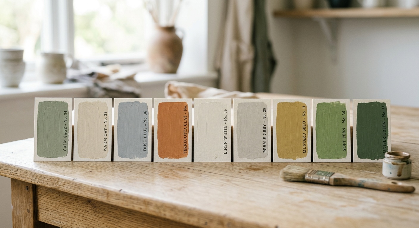
The standout living room color of 2026 is what designers are calling Moody Earth—a range of warm, terracotta-adjacent tones mixed with deep clay and warm stone. Benjamin Moore’s color of the year, “Cinnamon Slate,” sits right in this category: a warm, brownish-mauve that reads differently depending on your lighting. In morning sun, it glows amber. In artificial evening light, it deepens to something almost plummy.
Other strong living room performers include:
- Warm Sage Green: A 2025 carry-over that’s still incredibly relevant. Think Sherwin-Williams’ “Privilege Green” or Farrow & Ball’s “Mizzle.” These greens ground a space without making it feel dark.
- Soft Terracotta: Earthy, Mediterranean-influenced, and deeply cozy. Works beautifully with natural wood tones and linen fabrics.
- Dusty Blue-Gray: A timeless choice that bridges cool sophistication with warmth when paired with brass or gold hardware.
- Creamy Off-White: Never goes out of style. Dulux’s “Almond White” has been a top seller for three consecutive years because it reads clean without the sterility of pure white.
A Real-World Example: The Open-Plan Challenge
Consider the scenario many homeowners face: an open-plan living and dining area where a single wall color needs to serve dual purposes. Interior designer Sofia Marchetti, based in Austin, Texas, shared a 2025 project on her widely followed design blog where she tackled exactly this. Her solution? She used a warm taupe (Benjamin Moore’s “Pale Oak”) across all walls but introduced a deep forest green accent wall behind the dining area to visually separate the zones without building walls. The result was a cohesive yet distinctly divided space—all achieved with paint.
Pro Tip: If you have an open-plan space, use one light neutral as your base and reserve deeper accent colors to define functional zones. It’s cheaper than renovation and far more flexible.
Bedroom: Colors That Actually Help You Sleep
Your bedroom should be a sanctuary, and color plays a surprisingly clinical role in sleep quality. A landmark study published in the Journal of Environmental Psychology (2024) found that participants sleeping in blue or soft green rooms reported falling asleep an average of 17 minutes faster and waking fewer times during the night compared to those in red or yellow rooms.
The Sleep-Optimized Color Palette
In 2026, the most recommended bedroom colors by sleep therapists and interior designers align closely:
- Soft Blue: The undisputed champion of sleep-promoting colors. Sherwin-Williams’ “Watery” and Benjamin Moore’s “Quiet Moments” are current favorites.
- Warm Lavender: A gentle, slightly purple hue that promotes relaxation without feeling cold. Particularly effective in rooms with minimal natural light.
- Muted Green: Biophilic design—bringing nature indoors—is a major 2026 theme. Soft, muted greens like “Sage Advice” by Valspar connect us subconsciously to natural environments.
- Warm Greige: For those who can’t commit to color, a warm beige-gray hybrid creates a cocoon-like atmosphere that feels both neutral and deeply comfortable.
- Deep Navy (Accent Only): On a single wall behind the bed, navy creates a dramatic focal point and frames the sleeping area beautifully—but avoid painting all four walls unless the room is very well-lit.
What to Avoid in the Bedroom
Equally important is knowing what not to do. Bright yellows and oranges stimulate the nervous system and raise cortisol levels—the opposite of what you need for restful sleep. Pure white, while visually clean, can create a clinical feel that some find mentally stimulating rather than restful. And highly saturated reds? They’ve been shown to increase heart rate. Save the red for the dining room accent wall.
Case Study: A 2025 home renovation featured in Architectural Digest documented a couple in Seattle who had struggled with poor sleep for years. Their bedroom was painted a bold coral—a color they loved aesthetically but which was, according to their eventual consultation with a wellness interior designer, likely contributing to sleep disruption. They repainted with Benjamin Moore’s “Sea Salt” (a soft aqua-green), added blackout curtains, and reported a dramatic improvement in sleep quality within two weeks. Color alone isn’t a cure-all, but it’s a powerful contributing factor.
Kitchen & Dining: Appetite-Enhancing Palettes
The kitchen is where function meets flavor, and the right paint color can genuinely influence how much you enjoy both cooking and eating. This is the one room where warmer, more energetic colors actually serve the space’s purpose.
In 2026, kitchen color trends are moving away from the all-white cabinets-and-white-walls aesthetic that dominated for a decade. Homeowners are embracing contrast, warmth, and personality. Some of the most on-trend kitchen wall colors include:
- Warm White or Ivory: Still the most practical choice for kitchen walls, but with a warmer undertone than the cool whites of the 2010s. Look for “Old White” by Farrow & Ball or “Chantilly Lace” by Benjamin Moore.
- Butter Yellow: A soft, sophisticated yellow that evokes sunshine and warmth. Not the screaming yellow of decades past—think more “aged linen soaked in afternoon light.”
- Soft Sage or Herb Green: Particularly beautiful in kitchens with wood accents or open shelving with plants. Creates an organic, farm-kitchen aesthetic.
- Deep Forest Green (Lower Cabinets): The two-tone kitchen—upper cabinets in white or cream, lower cabinets in a deep green or navy—is at peak popularity in 2026 and shows no signs of fading.
Quick Tip: In kitchens, consider your cabinet color before choosing your wall color—not after. The walls should complement the cabinets, not compete with them. If your cabinets are white, almost any wall color works. If your cabinets are wood-toned, avoid walls with yellow or orange undertones that can clash.
Bathroom: Spa Vibes on a Budget
The bathroom is where a single gallon of paint can make the most dramatic difference. Because bathrooms are typically small, the color impact per square foot is enormous. The right shade transforms a builder-grade bathroom into something that feels genuinely luxurious. The wrong shade makes it feel like a gas station restroom.
The 2026 bathroom color direction is firmly rooted in what designers are calling the “Wellness Aesthetic”—colors that evoke high-end spas, natural mineral springs, and Scandinavian hygge. Key colors include:
- Soft Mineral Green or Eucalyptus: The spa color. Calming, clean, and universally flattering in artificial light.
- Warm Stone or Travertine-Inspired Beige: Connects to the natural stone bathroom aesthetic without the price tag of actual stone.
- Misty Blue-Gray: Cool but not cold, this color reads beautifully against white fixtures and chrome hardware.
- Deep Charcoal or Slate: For bold homeowners, a dark-painted bathroom creates a dramatic, cocoon-like feel—especially powerful in powder rooms where the lack of windows isn’t a practical concern.
Important Practical Note: Always use a bathroom-specific paint formula in wet areas. These contain mold and mildew inhibitors and withstand humidity far better than standard interior paints. Benjamin Moore’s Aura Bath & Spa and Sherwin-Williams’ Emerald Interior are both excellent choices in 2026.
Home Office: Focus-Boosting Hues
With remote and hybrid work still accounting for 43% of professional work arrangements in 2026 (Gallup Workplace Report, 2025), the home office has become a critical space. Its color should promote focus, reduce fatigue, and—perhaps most importantly—look professional on video calls.
Research from the University of Texas (2024) found that employees working in environments with blue-green wall tones reported 23% higher productivity scores and lower afternoon energy crashes compared to those in white or red environments. The practical recommendations for 2026 home offices:
- Medium Blue (Not Too Bright, Not Too Dark): Proven focus enhancer. Sherwin-Williams’ “Anchors Aweigh” hits the sweet spot.
- Warm Green: Reduces eye strain for screen-heavy workers. A 2024 ergonomics study found that workers in green-painted offices blinked more frequently (a sign of reduced eye tension) than those in neutral environments.
- Soft Olive: Intellectual, warm, and grounding. Pairs well with dark wood furniture for a library-like feel that signals authority on video calls.
- Warm Cream or Off-White: The practical choice for those who prefer neutrals—opt for warm undertones rather than cool to avoid the “fluorescent lit office” effect.
Color Comparison Table by Room
| Room | Best Color Family | 2026 Top Pick | Avoid | Mood Effect |
|---|---|---|---|---|
| Living Room | Warm Neutrals, Earth Tones | Cinnamon Slate (BM) | Stark White | Welcoming, Conversational |
| Bedroom | Blues, Greens, Lavenders | Quiet Moments (BM) | Bright Red, Orange | Restful, Calming |
| Kitchen | Warm Whites, Sage, Yellow | Old White (F&B) | Cold Blue-Gray | Energizing, Appetite-Stimulating |
| Bathroom | Mineral Greens, Stone Beige | Eucalyptus (SW) | Highly Saturated Tones | Spa-Like, Cleansing |
| Home Office | Medium Blue, Warm Green | Anchors Aweigh (SW) | Bright Yellow, Red | Focused, Productive |
2026 Interior Paint Color Trend Popularity
Based on aggregate data from Houzz, Pinterest Trends, and Google Search Analytics in 2025–2026, here’s how major paint color families rank by homeowner search interest and project adoption rates:
3 Common Paint Color Mistakes (and How to Fix Them)
Mistake #1: Choosing Color From a Tiny Swatch Card
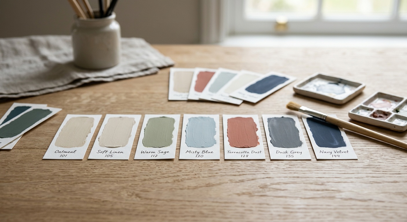
This is the single most common—and costly—painting mistake. That tiny 2-inch chip on a bright white card in fluorescent store lighting bears almost no resemblance to how a color will look on your full wall in your specific light conditions. Colors appear dramatically different depending on whether your room faces north (cooler, bluer light) or south (warmer, yellower light), and whether you’re seeing them under LED, incandescent, or natural daylight.
The Fix: Purchase sample pots (most brands now offer them for $5–$8) and paint two large poster boards—at least 12 x 12 inches—with your candidate colors. Pin them to different walls in your room and observe them at different times of day and under different artificial lights before committing. Many paint brands also offer virtual room visualization apps in 2026; Sherwin-Williams’ ColorSnap and Benjamin Moore’s Personal Color Viewer have both significantly improved their AR capabilities.
Mistake #2: Ignoring Undertones
Every paint color has an undertone—a secondary hue lurking beneath the primary color that only reveals itself once applied broadly. That “gray” you loved on the card? It might turn lavender or green once it’s on your walls. Undertones are responsible for approximately 60% of “I hate it” post-painting experiences, according to paint consultant research published in 2025.
The Fix: Learn to identify undertones before you buy. Hold the chip against a white piece of paper and look for the secondary color that emerges. When in doubt, stick to colors described as “warm gray,” “cool beige,” or “blue-green” rather than just “gray,” “beige,” or “blue”—specificity in language usually reflects specificity in the actual color formula.
Mistake #3: Painting One Accent Wall and Calling It Done
The standalone accent wall trend—one bold wall, three neutral ones—peaked around 2015 and has since been replaced with more sophisticated approaches. In 2026, design-forward homes use color drenching (painting walls, trim, and even ceiling in the same or closely related tones) or two-tone approaches (different colors above and below a chair rail or picture rail) for far more intentional, architectural results.
The Fix: If you love a bold color, try applying it to three walls and keeping only one wall neutral, or paint the ceiling in a slightly lighter version of your wall color for a wraparound, immersive effect. Alternatively, embrace the color drench fully—it sounds scary but consistently produces stunning, magazine-worthy results when done with the right hue.
Frequently Asked Questions
What is the most universally flattering interior paint color for any room?
If forced to choose one color that works beautifully across nearly any room and lighting condition, most professional designers in 2026 point to a warm greige with slight yellow undertones—specifically something like Benjamin Moore’s “Pale Oak” or Sherwin-Williams’ “Accessible Beige.” These colors are warm enough to feel inviting, neutral enough to not dominate, and flattering to wood tones, fabrics, and skin tones alike. They also photograph well, which matters increasingly in an era of social media and real estate listings. That said, universally flattering doesn’t mean best for every purpose—a bedroom might benefit from a purpose-specific calming blue, even if warm greige is technically more versatile.
How do I choose paint colors for a small room without making it feel even smaller?
The conventional wisdom says “use light colors in small rooms,” and there’s truth to it—but it’s not the complete picture. Light colors do maximize the perception of space because they reflect more light. However, a deeply saturated dark color can actually create a cocooning effect that makes a small room feel intentionally intimate rather than cramped, especially in rooms without windows (like powder rooms). For genuinely small rooms with natural light constraints, your safest approach is a warm white or very light greige on walls AND ceiling—this removes the visual “cap” from the room and adds perceived height. Glossier finishes also reflect more light; consider a satin finish rather than flat for small rooms. The biggest space-killer in small rooms is actually cool, dark accent walls that create visual weight without depth.
Is it worth hiring a professional color consultant instead of choosing colors myself?
In many cases, yes—especially if you’re tackling multiple rooms simultaneously or have a complex space (open plan, unusual lighting, architectural quirks). Professional color consultants typically charge between $150 and $400 per session in 2026, and a single two-hour consultation can prevent thousands of dollars in repainting costs. Most major paint brands (Benjamin Moore, Sherwin-Williams, Farrow & Ball) offer complimentary in-store color consultations with trained staff, which is a solid starting point. For DIY-ers, investing in a few sample pots and using the brand’s digital visualization tools is the next best alternative. The key question to ask yourself: how confident are you in reading undertones and visualizing scale? If the answer is “not very,” the consultation fee pays for itself quickly.
Your Color Transformation Roadmap
Refreshing your home with the right paint colors isn’t just an aesthetic exercise—it’s an investment in how you feel every single day. The research is clear, the trends are directional, and the tools available in 2026 make the process more accessible than ever before. Here’s your practical action plan:
- Step 1 – Audit your rooms by function. Before buying a single paint chip, walk through your home and write down the primary emotional experience you want from each room: energizing, restful, focused, social, intimate. Let function drive color family, not the other way around.
- Step 2 – Sample ruthlessly. Order sample pots for your top two or three candidates per room. Paint large boards, not tiny patches. Observe under all lighting conditions for at least 48 hours before deciding.
- Step 3 – Consider the undertone first, the hue second. A warm-undertone blue will transform a room very differently than a cool-undertone blue. Identify undertones on every chip before it makes your shortlist.
- Step 4 – Choose finish strategically. Eggshell for living rooms and bedrooms, satin for kitchens and bathrooms, flat or matte for ceilings. The right sheen level is half the battle.
- Step 5 – Start with one room. Don’t try to transform your entire home in a weekend. Choose the room that bothers you most or that you spend the most time in, get it right, then build outward with a cohesive whole-home palette in mind.
As biophilic design, wellness-focused architecture, and AI-assisted color tools continue to reshape the interior design landscape through 2027 and beyond, one truth remains constant: the colors in your home profoundly shape your daily experience. This isn’t trend-chasing—it’s creating an environment that actively supports the life you want to live.
So here’s the question worth sitting with: If your walls could speak to your mood, your creativity, and your wellbeing—what would you want them to say?